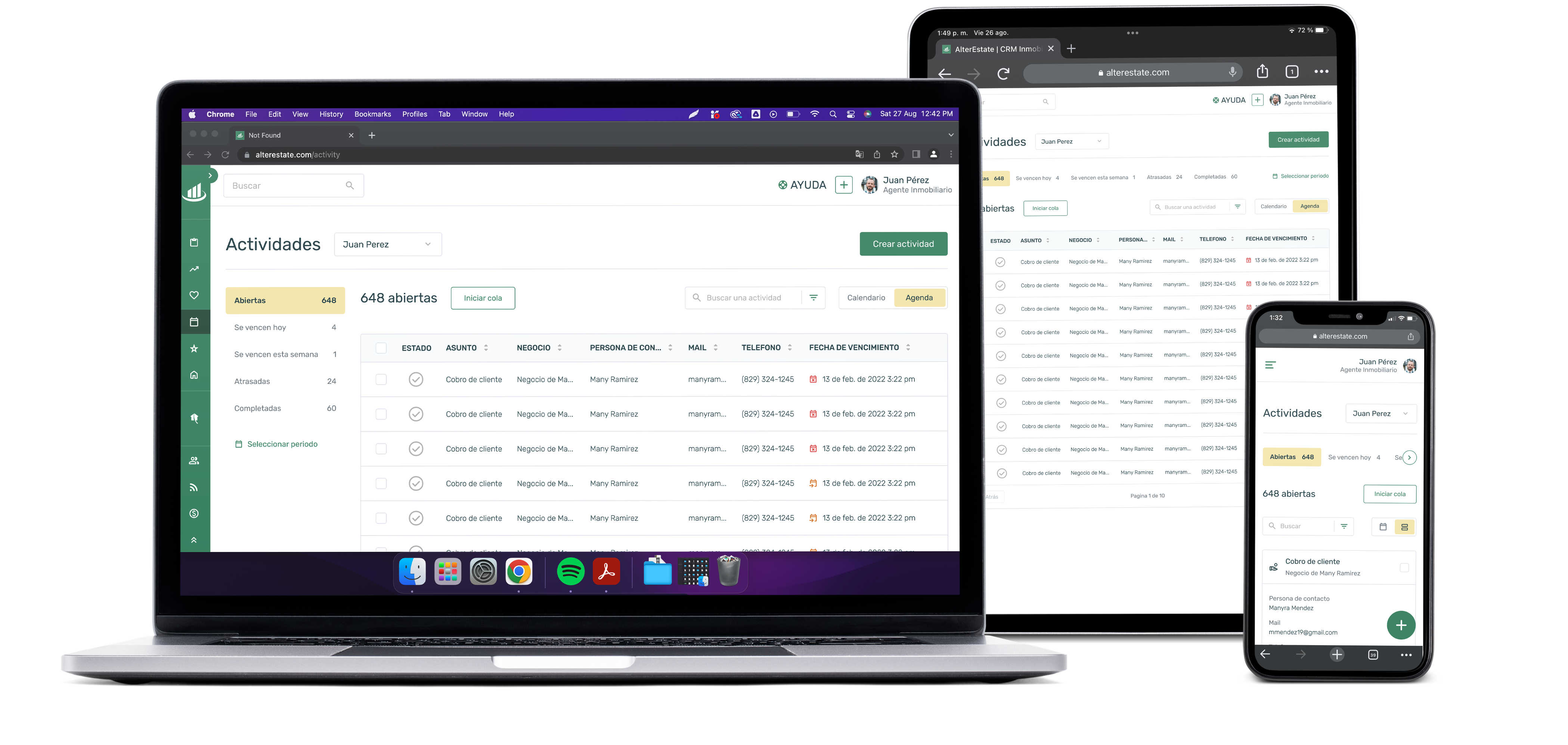

Alter Estate is a CRM for real estate agents, which allows its users to manage the entire process of selling a property, being also a Series A startup, financed by 500 Latam. Alter Estate is made up of more than 2,500 real estate agents and more than 30,000 properties to sell or rent on commission. In the same way, your captured properties can be negotiated by the other agents that use the platform for a commission agreed between both.
Alter Estate does not have a clear organization in the design patterns, which causes confusion for its users and makes it difficult to use in several of its sections. One of these sections is very important for agents, so it will be the one we will redesign in this case study. The mentioned section is Activities, where you can create a list of activities, according to your need, and also has activities created automatically by the platform as the agent interacts with the sale or rental of a property, which is supposed to facilitate the daily agenda of the agents, but due to its confusing design, some of the agents decide to migrate to other options.
The first part of the survey consisted of a heuristic analysis to explain to the stakeholders the problems encountered in the user experience and how these could be affecting the performance of the users.
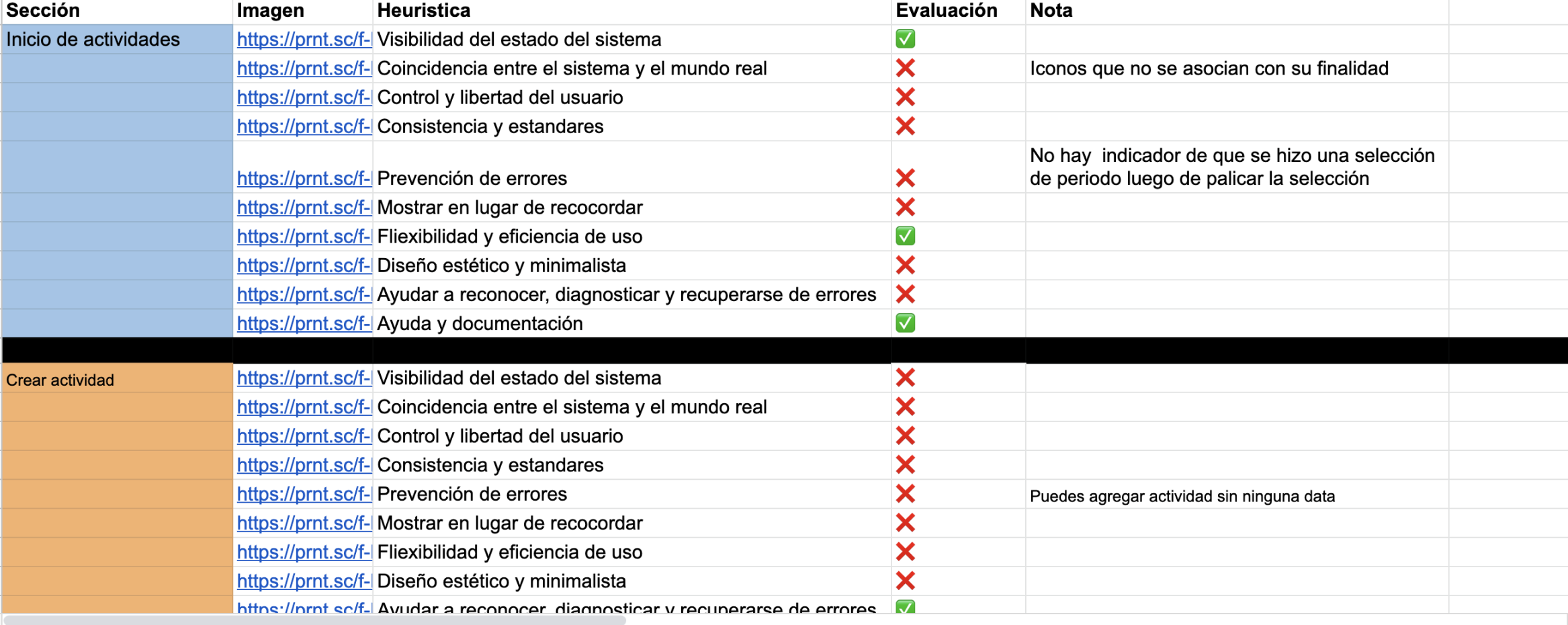
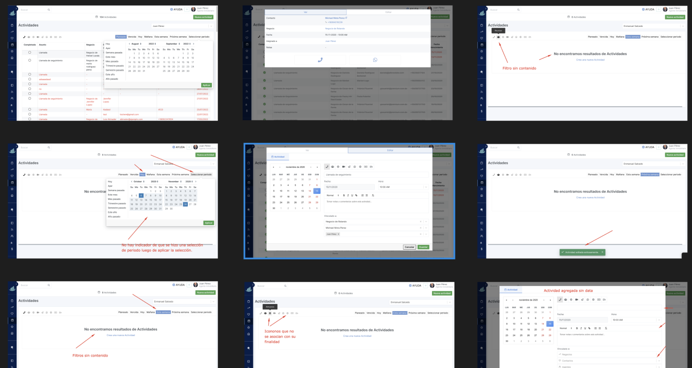
Alter Estate's target audience is real estate agents who need to sell more to have a bigger team. The agents subscribed to the platform affirm that the tool has potential and can be useful to them in their day-to-day, but by not understanding it at first, the agents fall into recurring consultations with technical support so that they can explain how it works. To better understand how clarity and organization within a real estate agent work, I reviewed over 10 online articles and organized the review data into excel sheets. The Excel sheets resulted in a total of 18 rows. Analyze the data provided and highlight the most important information.

To discuss the data found, I met with the person in charge of the product, where we were able to corroborate several of the findings and others that served as the basis for brainstorming.

Key results:
Complaints have been received from users about how difficult it is for them to keep track of and organize their tasks.
The product must be comfortable for the user. You must manage a design focused on the needs of your users like the Google Calendar tool.

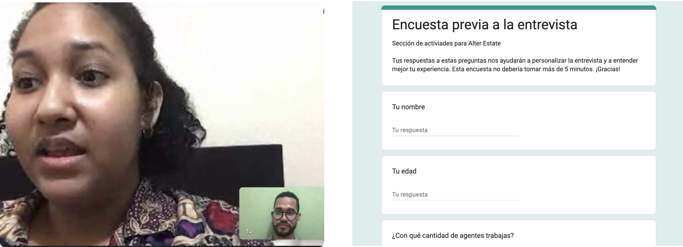
After the stakeholders gave me a sample of users to collect information from their point of view, I decided to create a survey to make the interviews as accurate as possible. We were able to collect data that later served us to put together the user persona and the user flow.
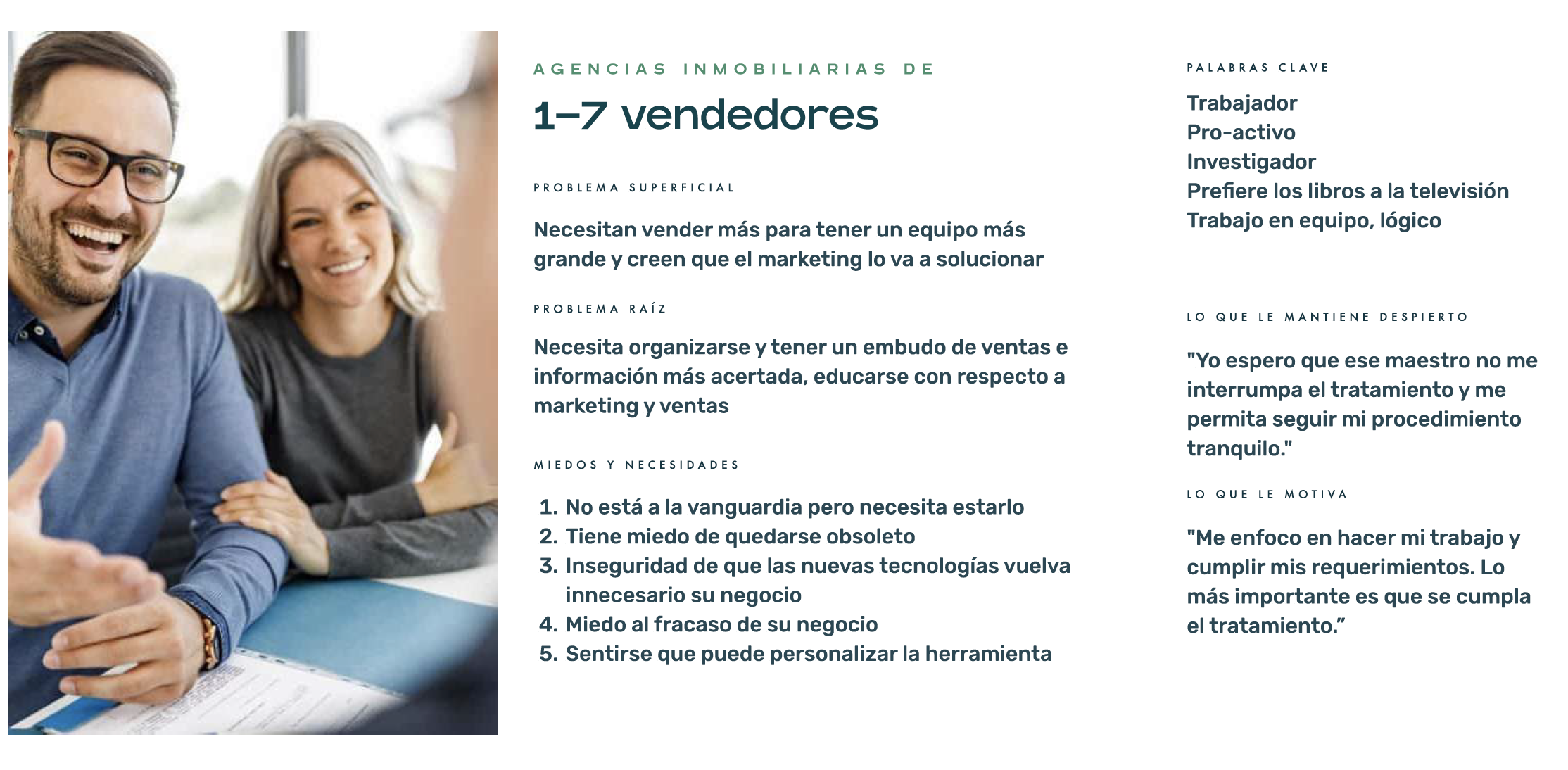
After interviews with users, surveys and research in the company's database, we were able to put together this archetype, to take into account how its characteristics could guide us to a more personalized experience.
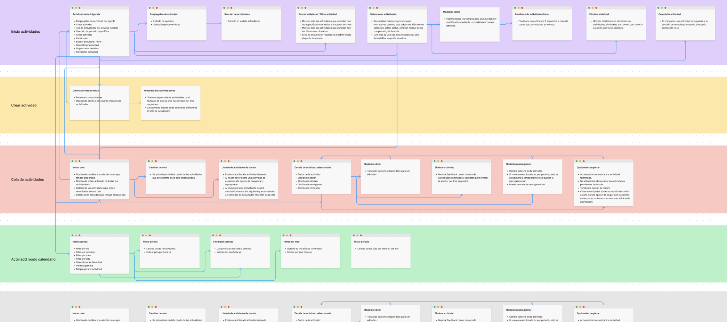
The activities section has many functionalities and features. To make the product more manageable, we re-evaluated all functionality, created a section map of all pages, and defined a user flow that was easier to understand.
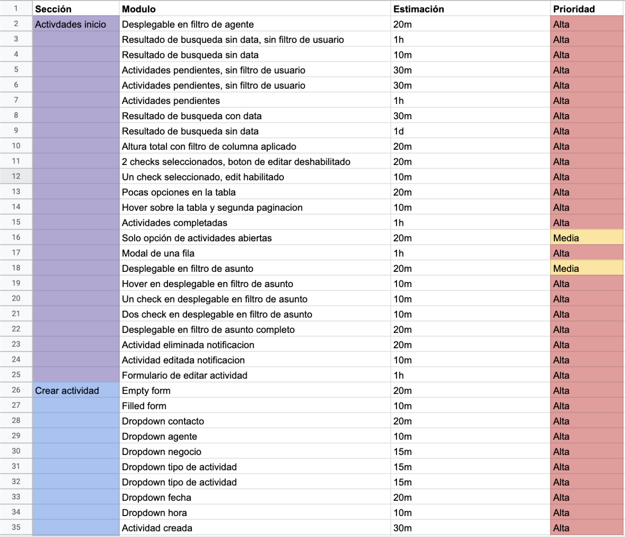
After several survey meetings, I broke down in detail each screen that would be developed. The most important thing about this step is to be able to identify even the smallest interaction of each of them so that when the development team carries out the implementation, it can be clear about what it is going to develop and thus end with a good experience, not only for the end user, but also for the internal team when it comes to working.

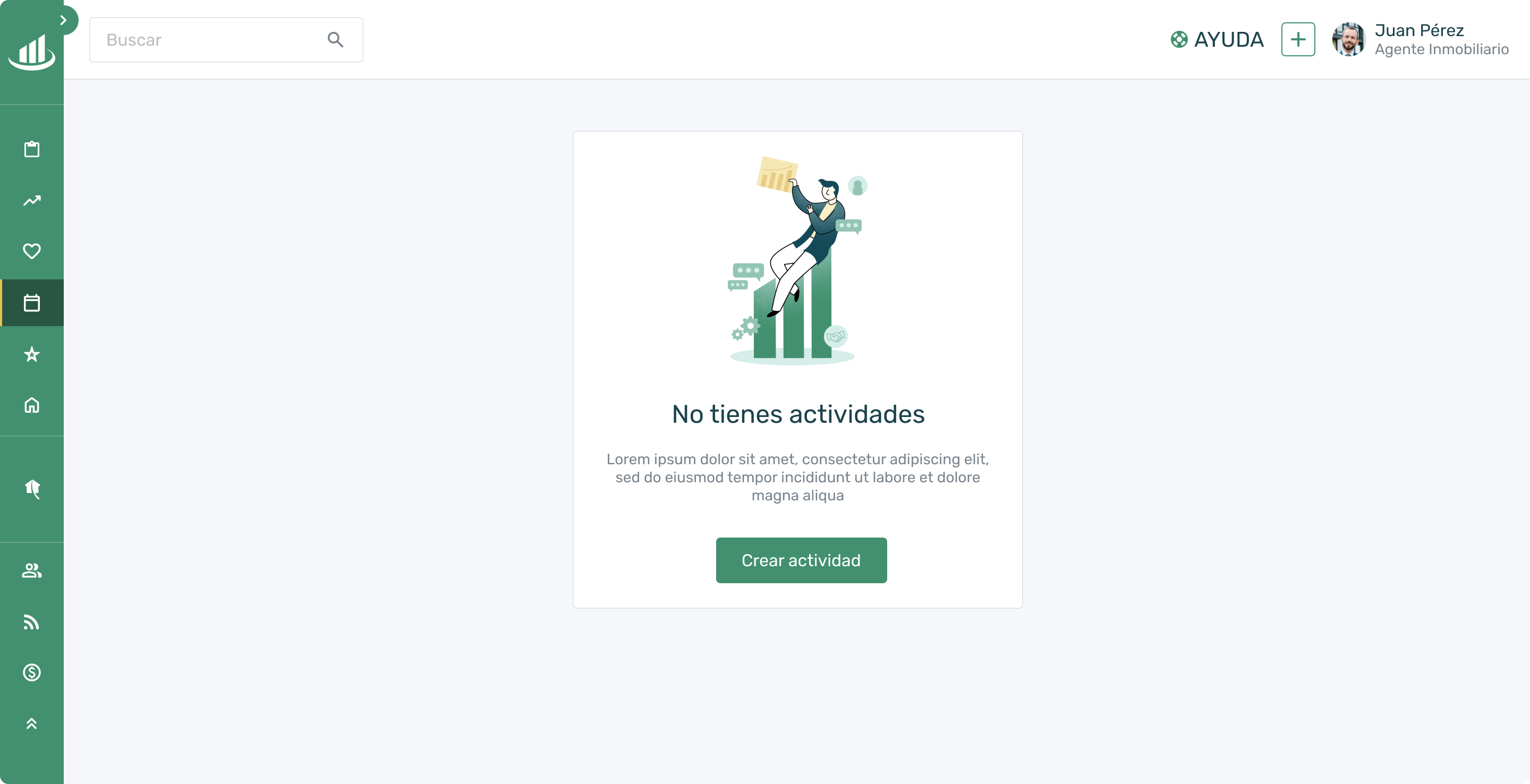
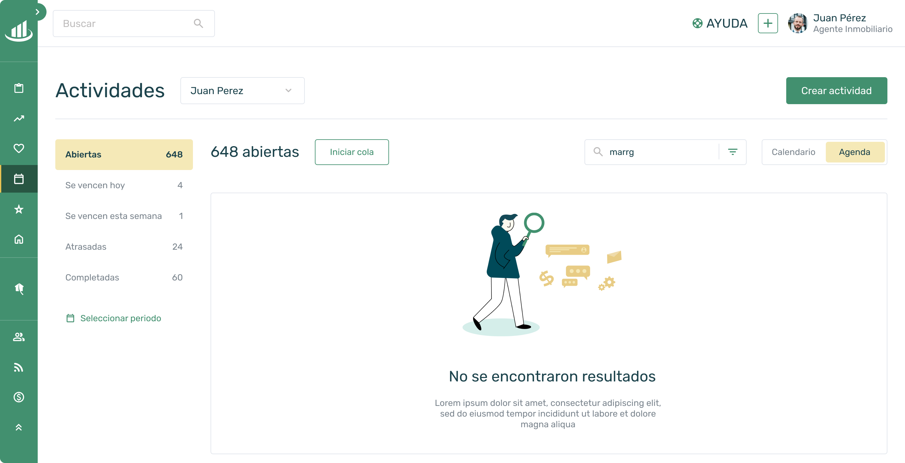
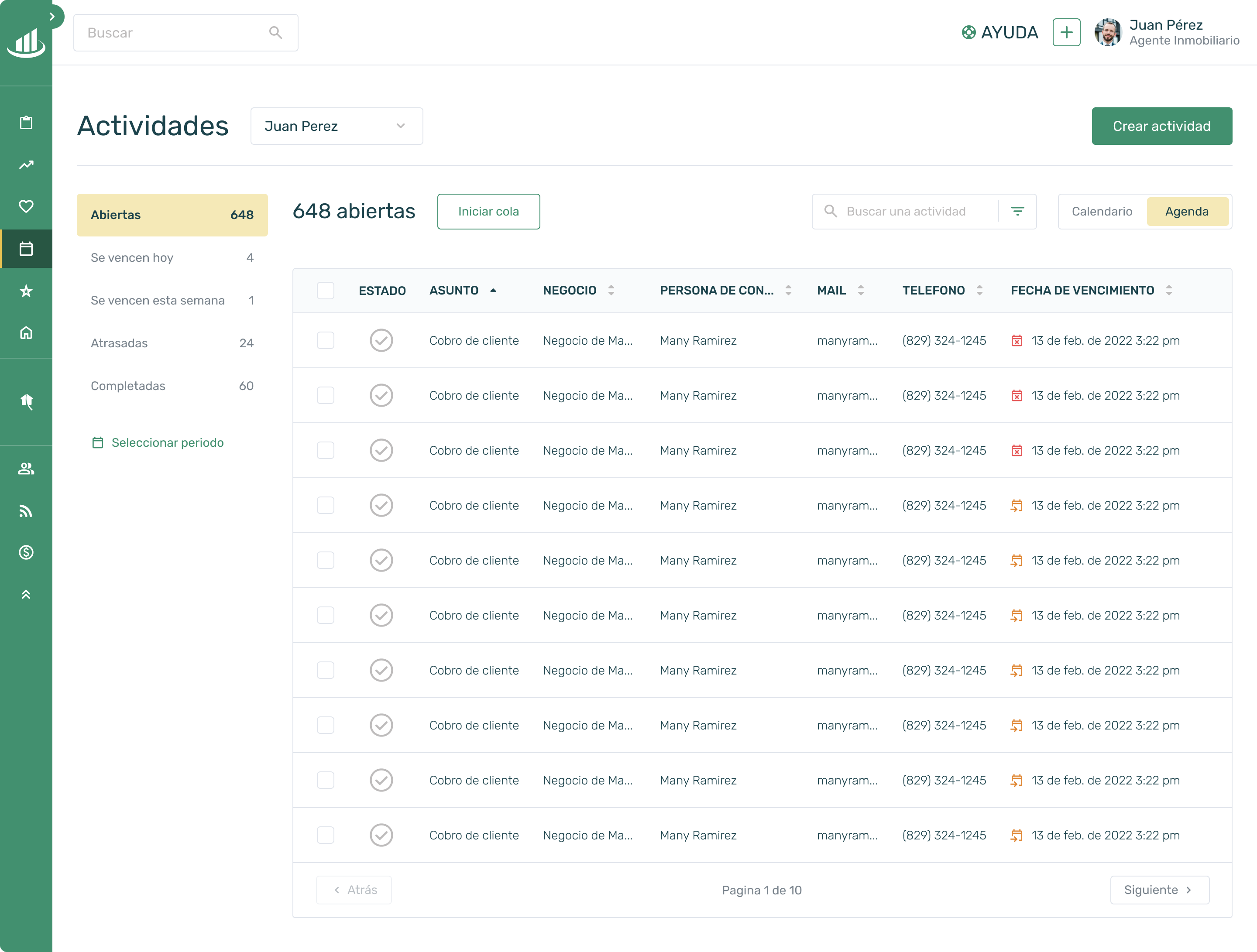
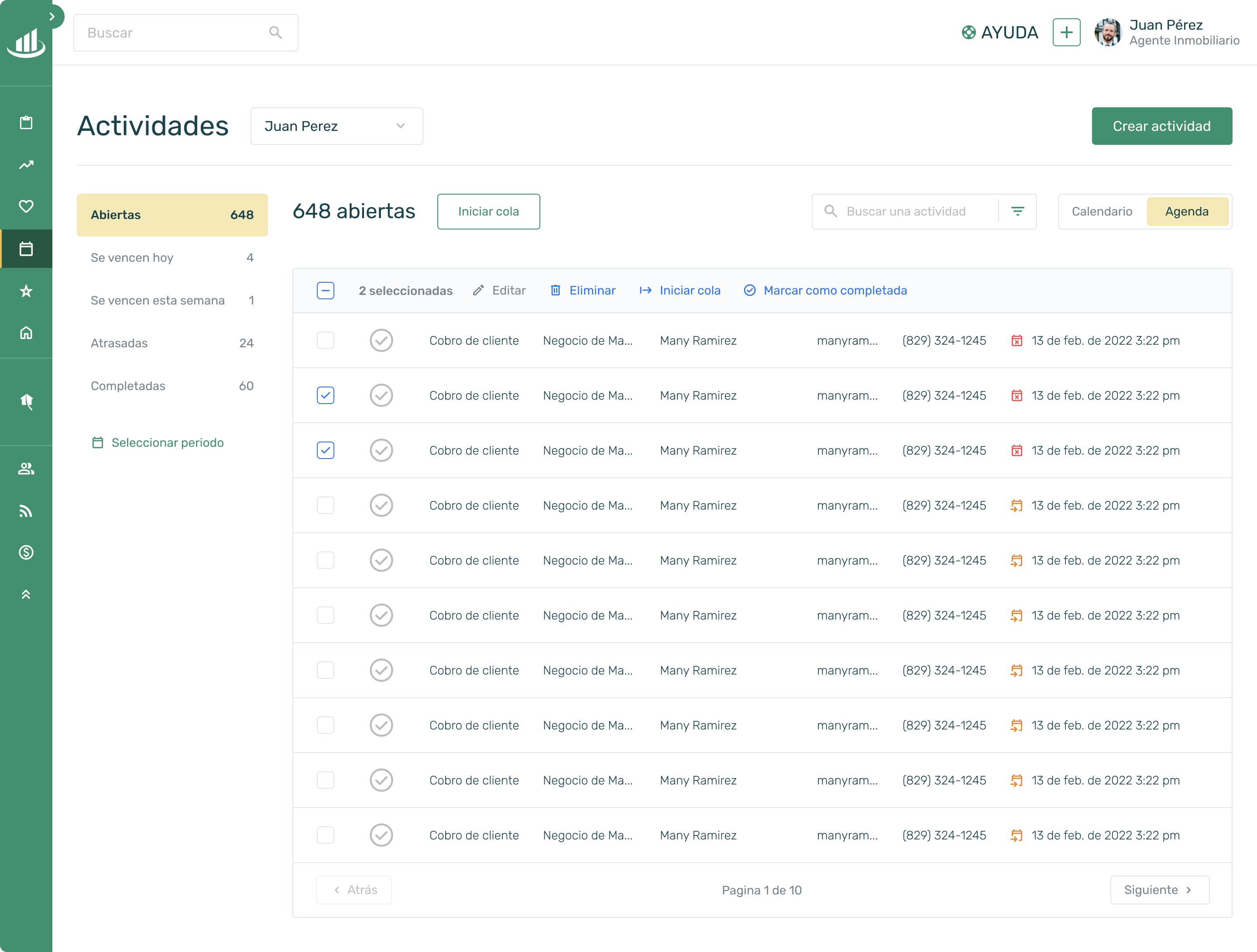
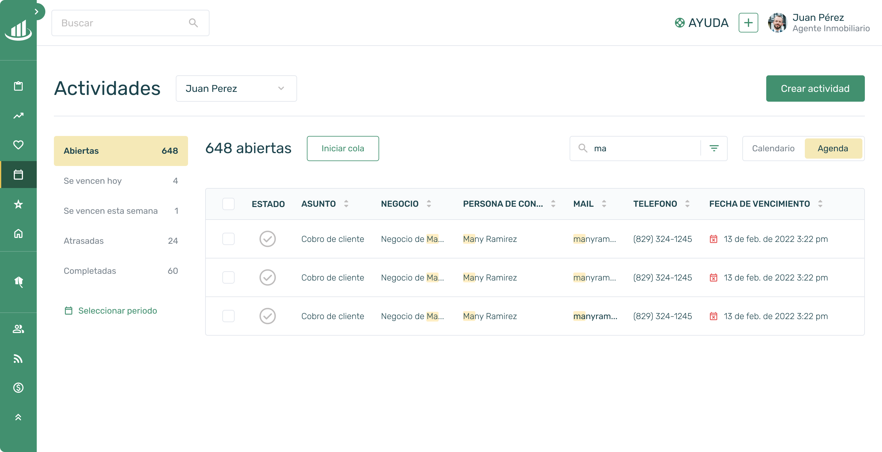
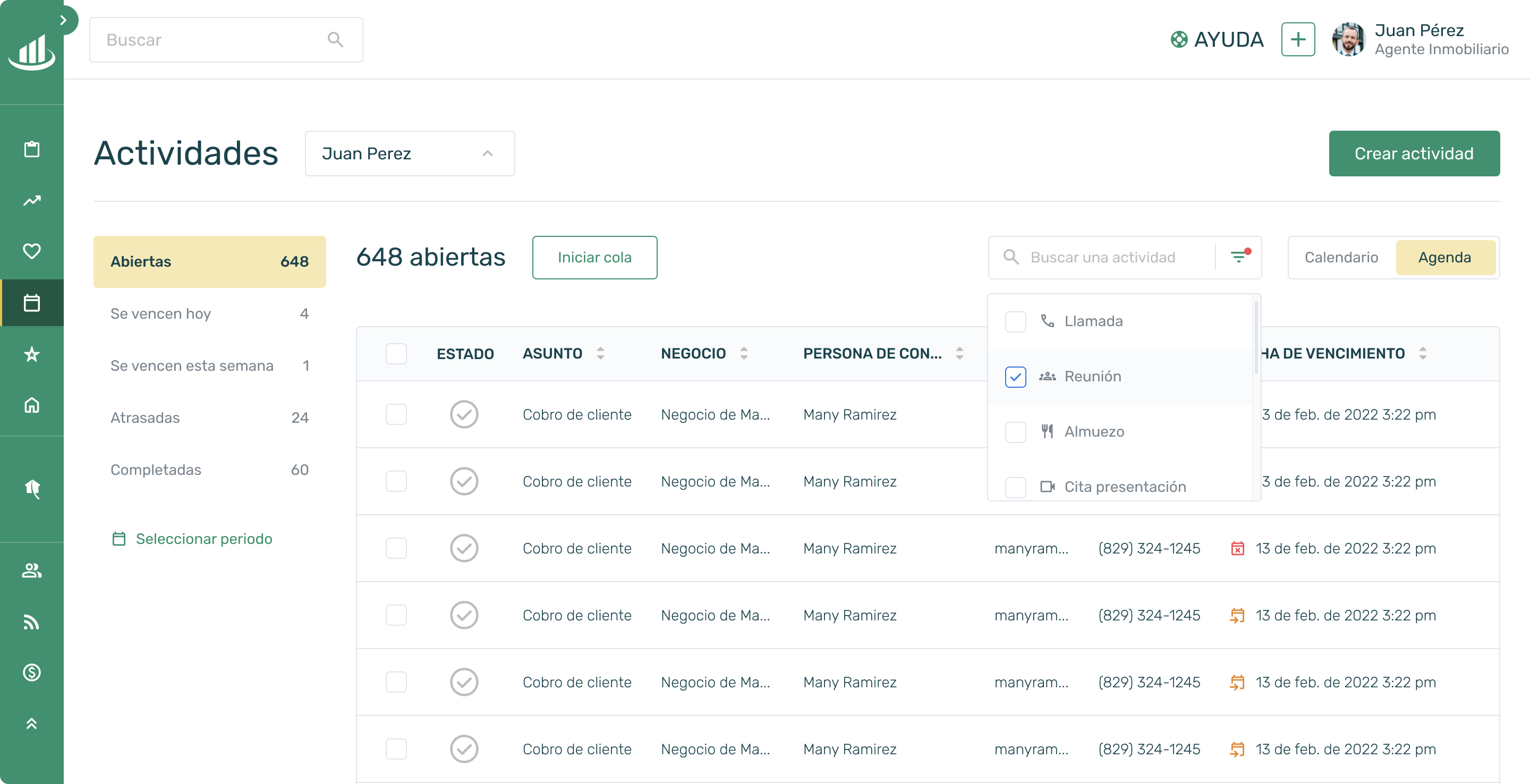
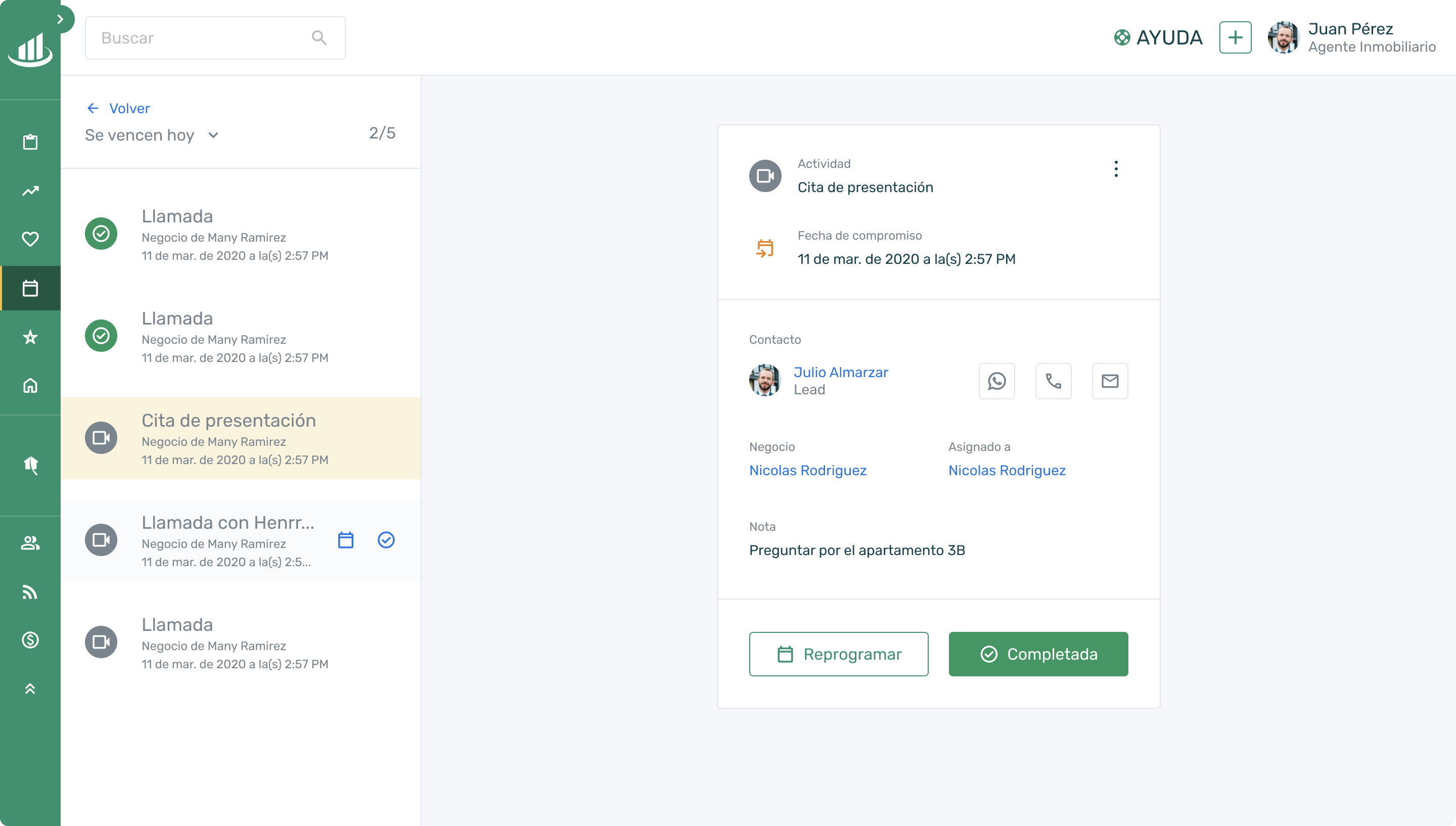
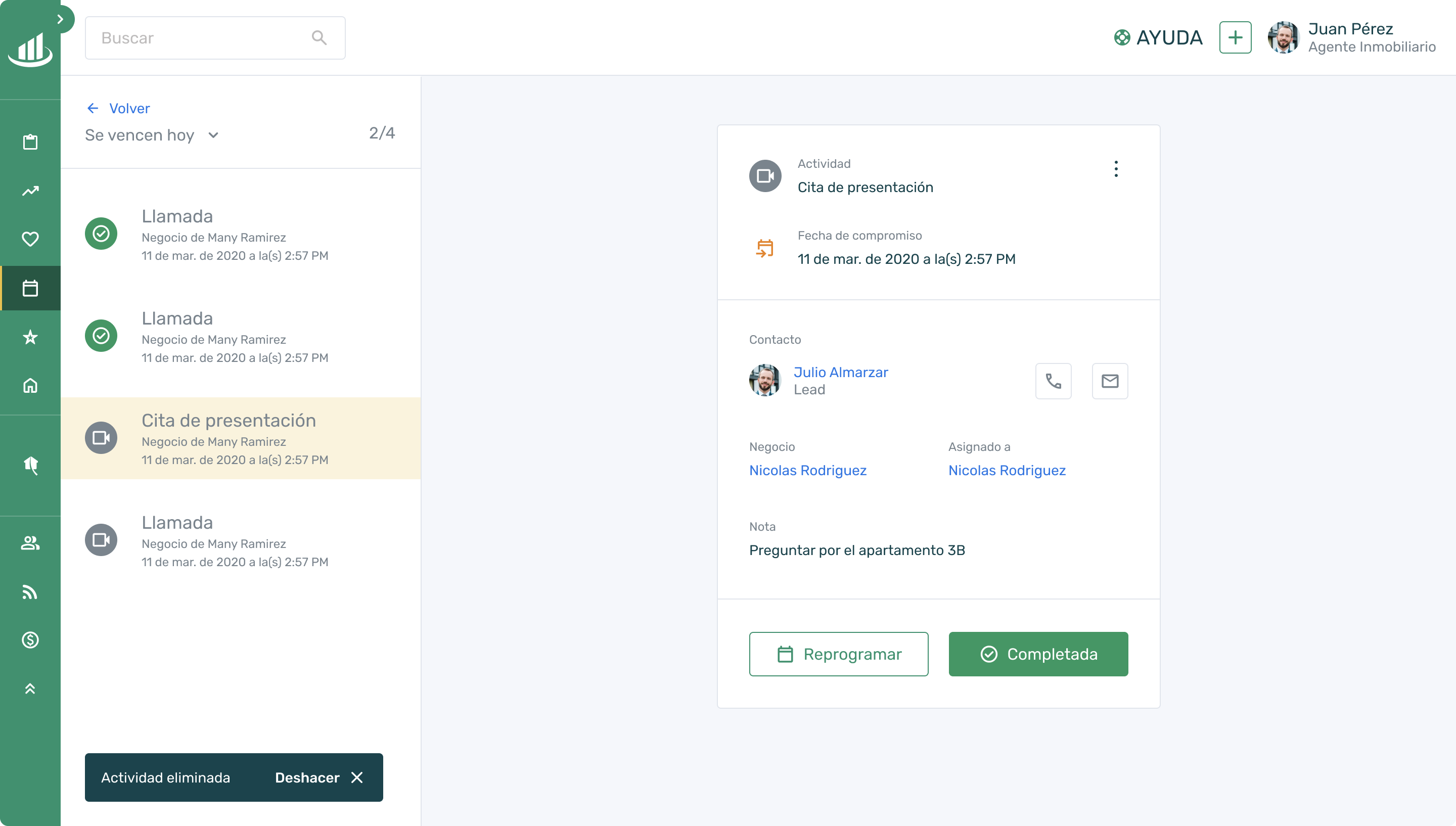
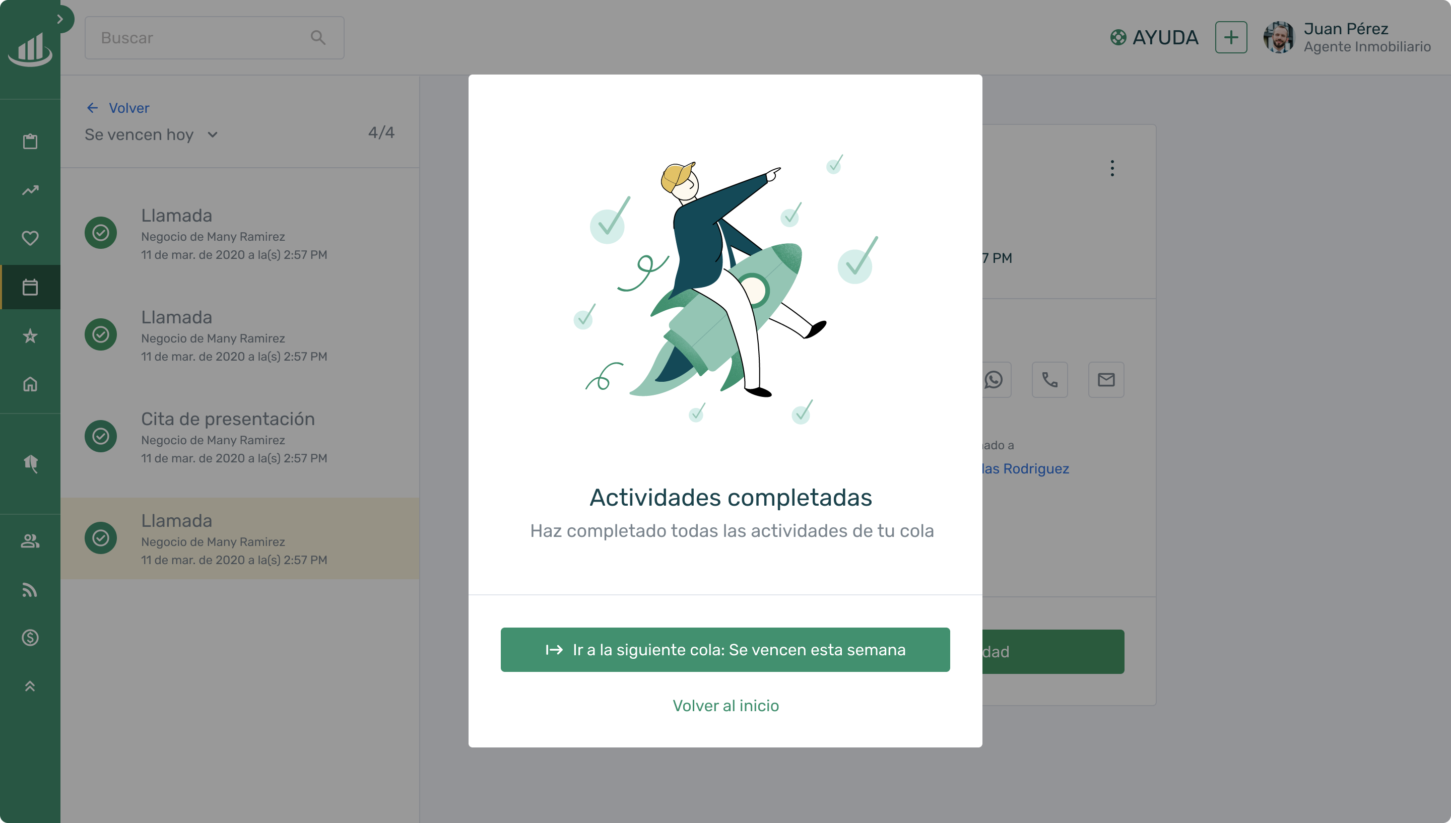
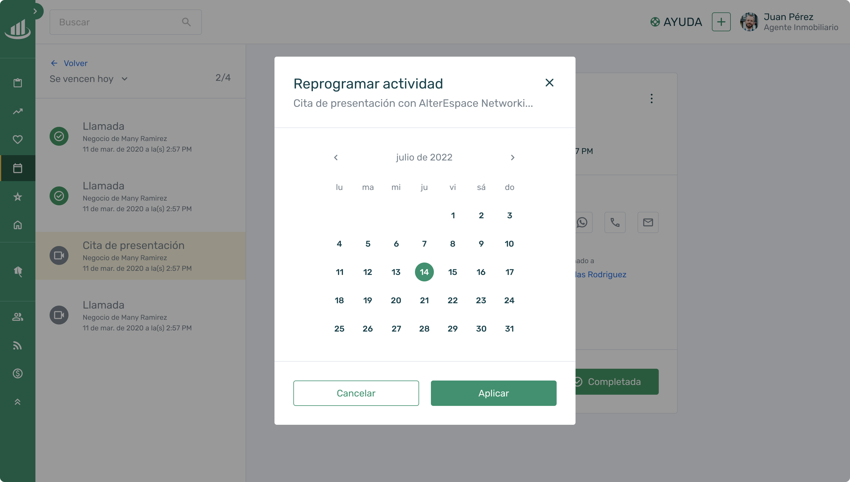
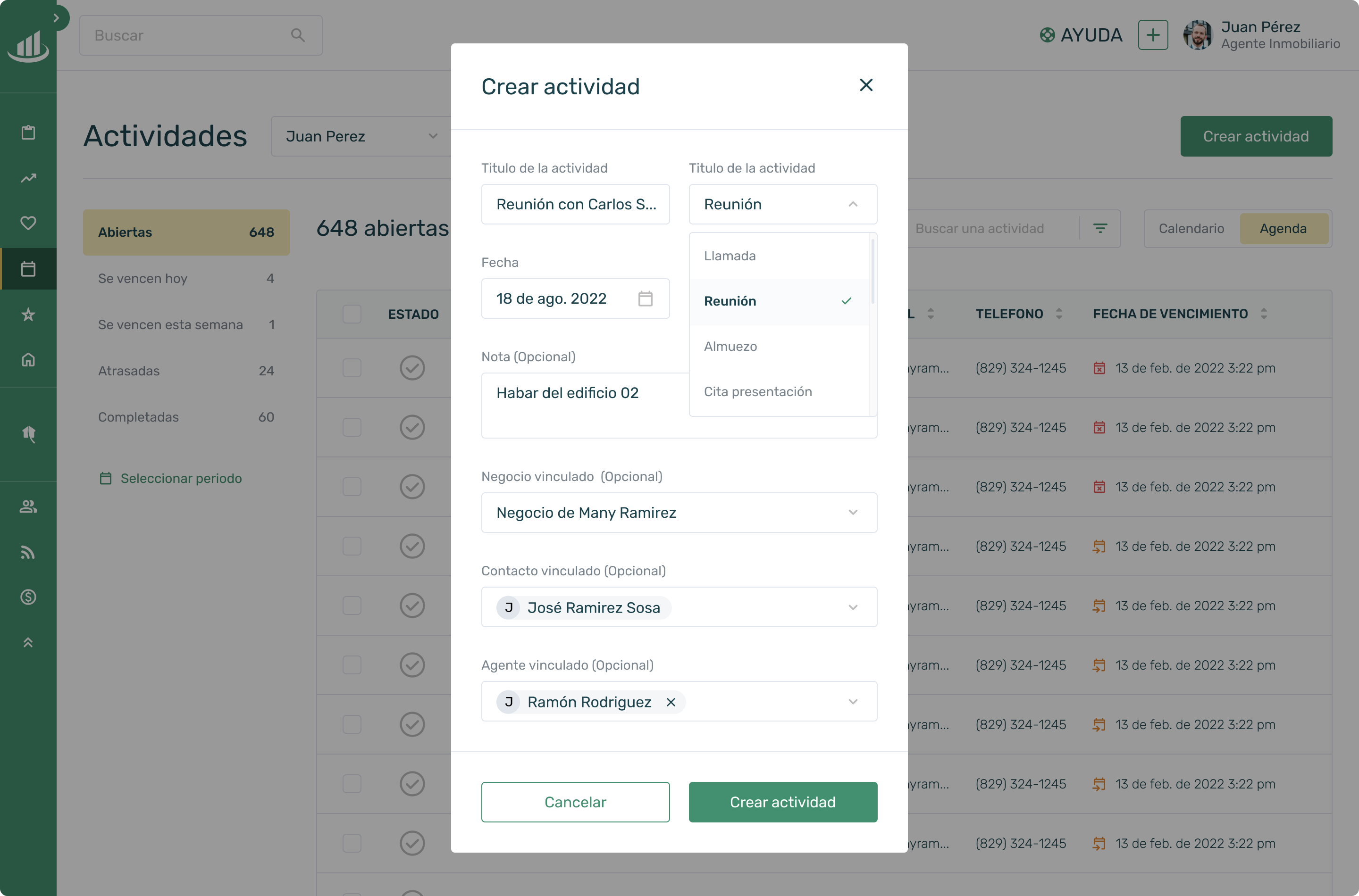
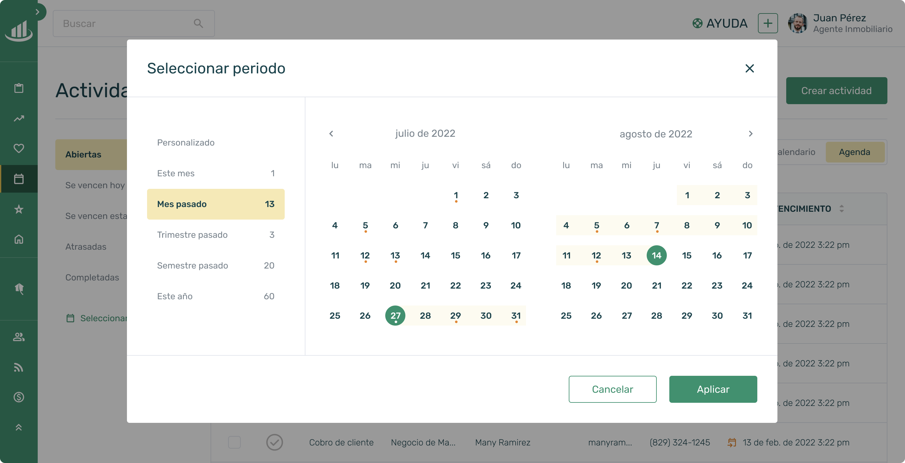
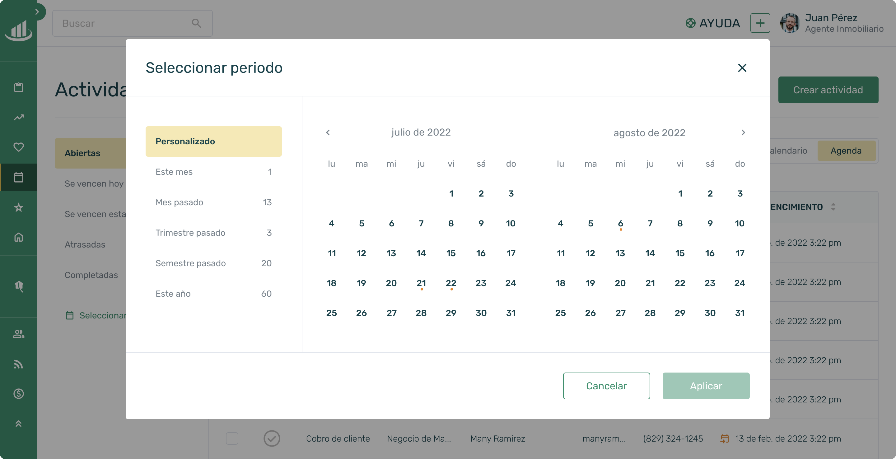
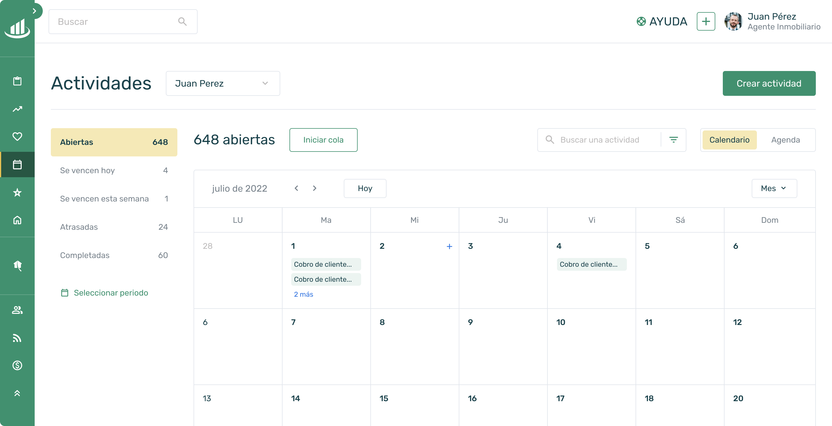
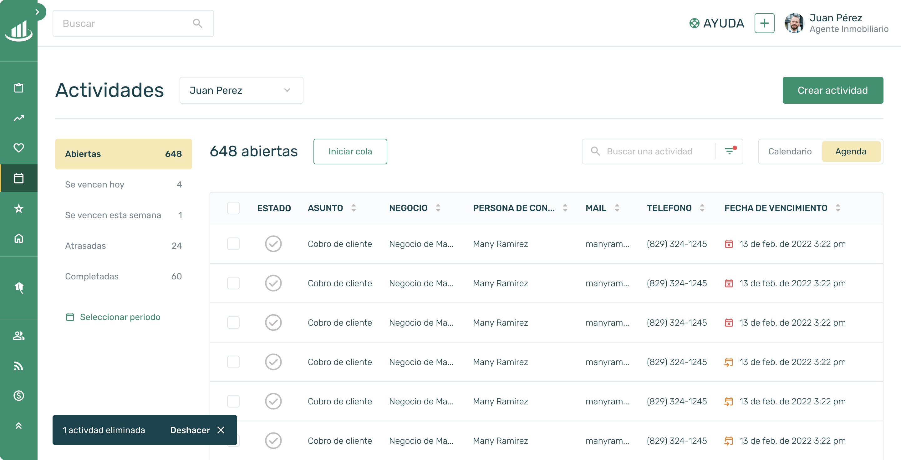
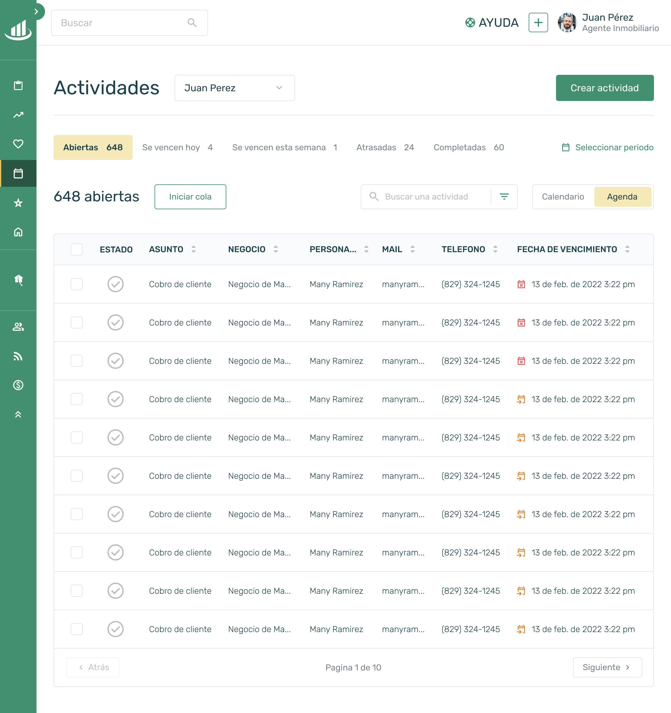
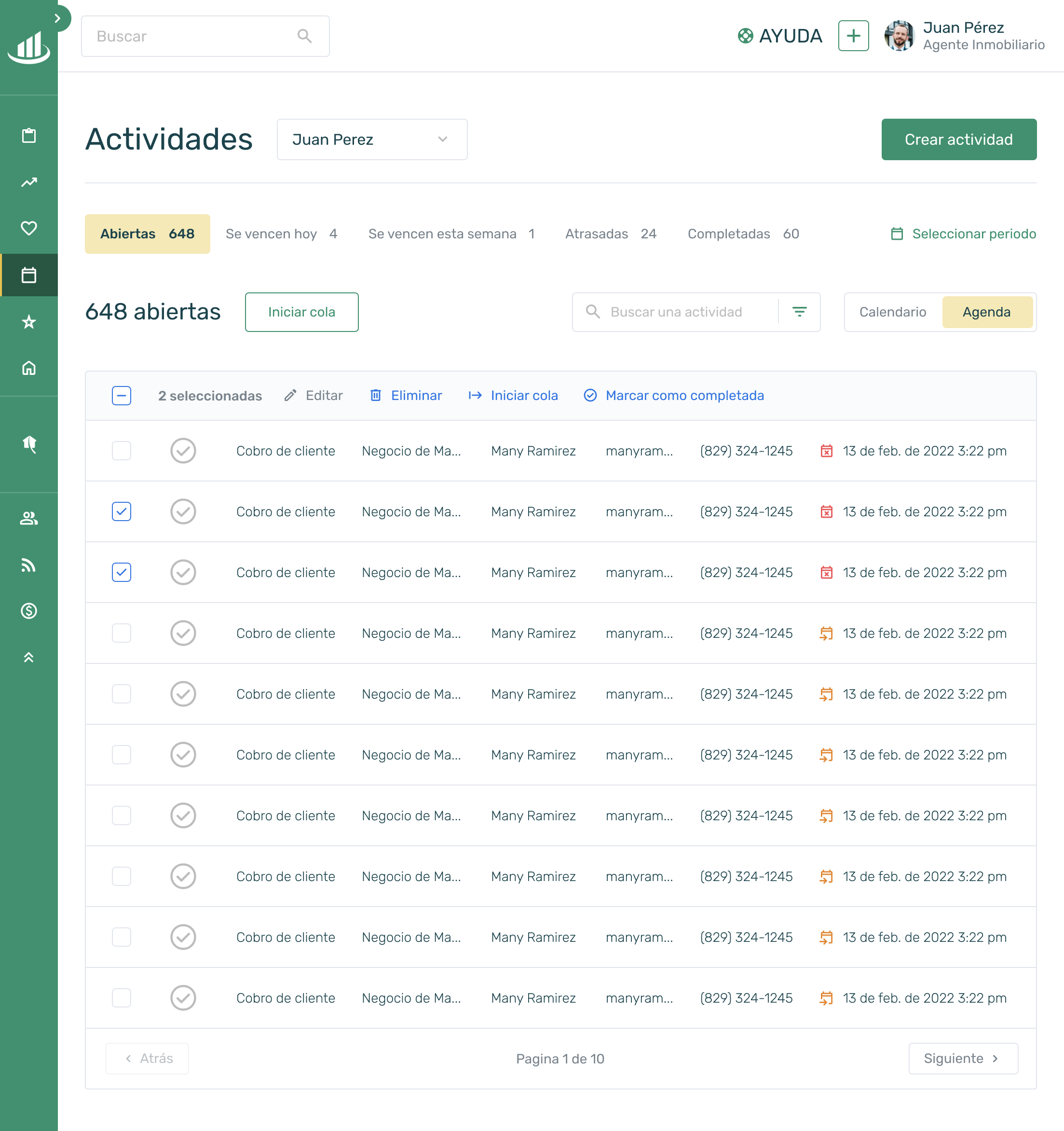
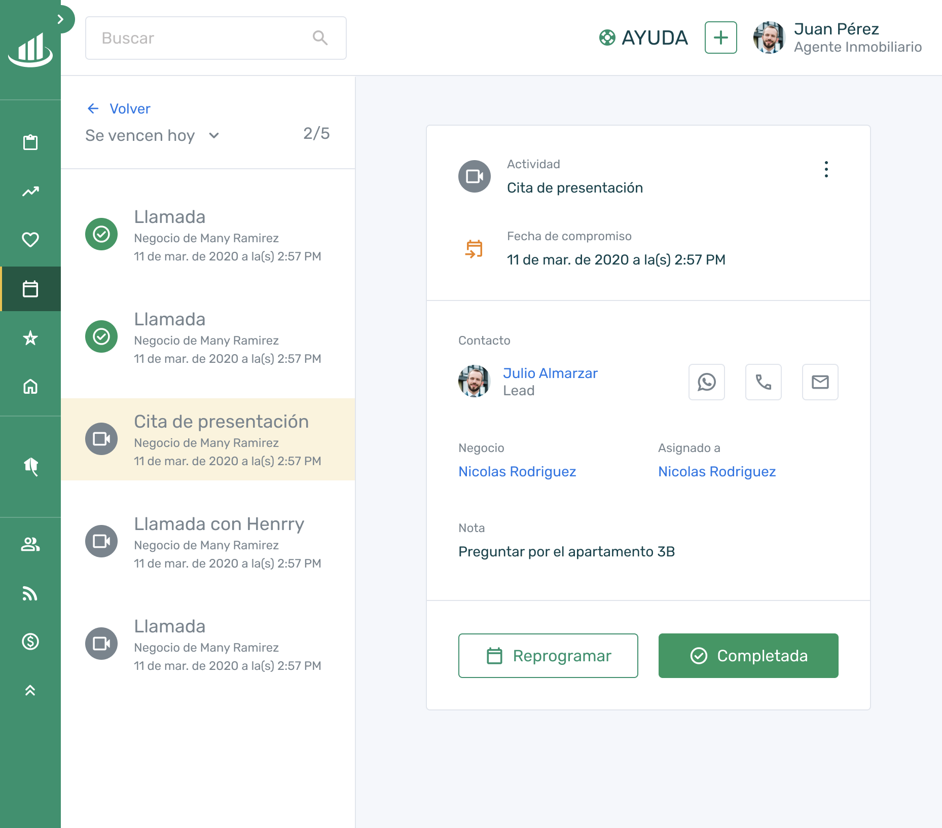
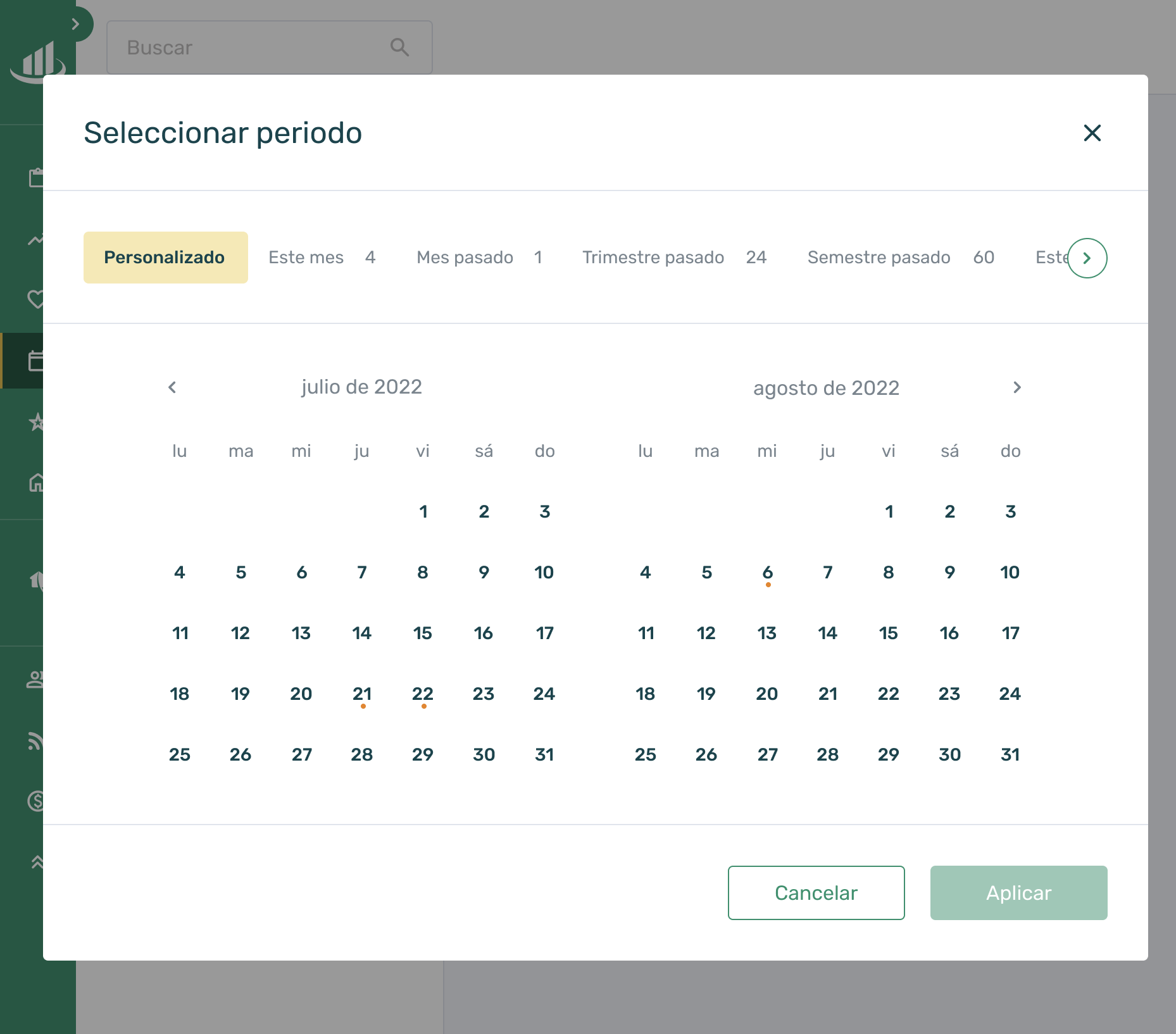
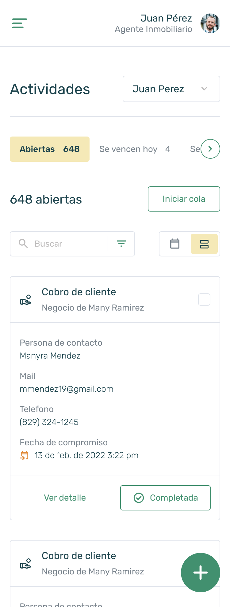
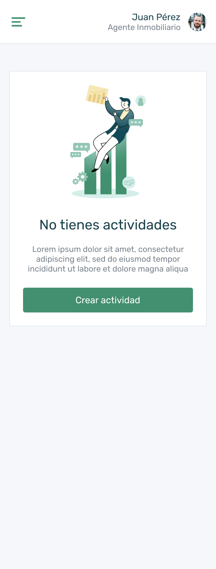
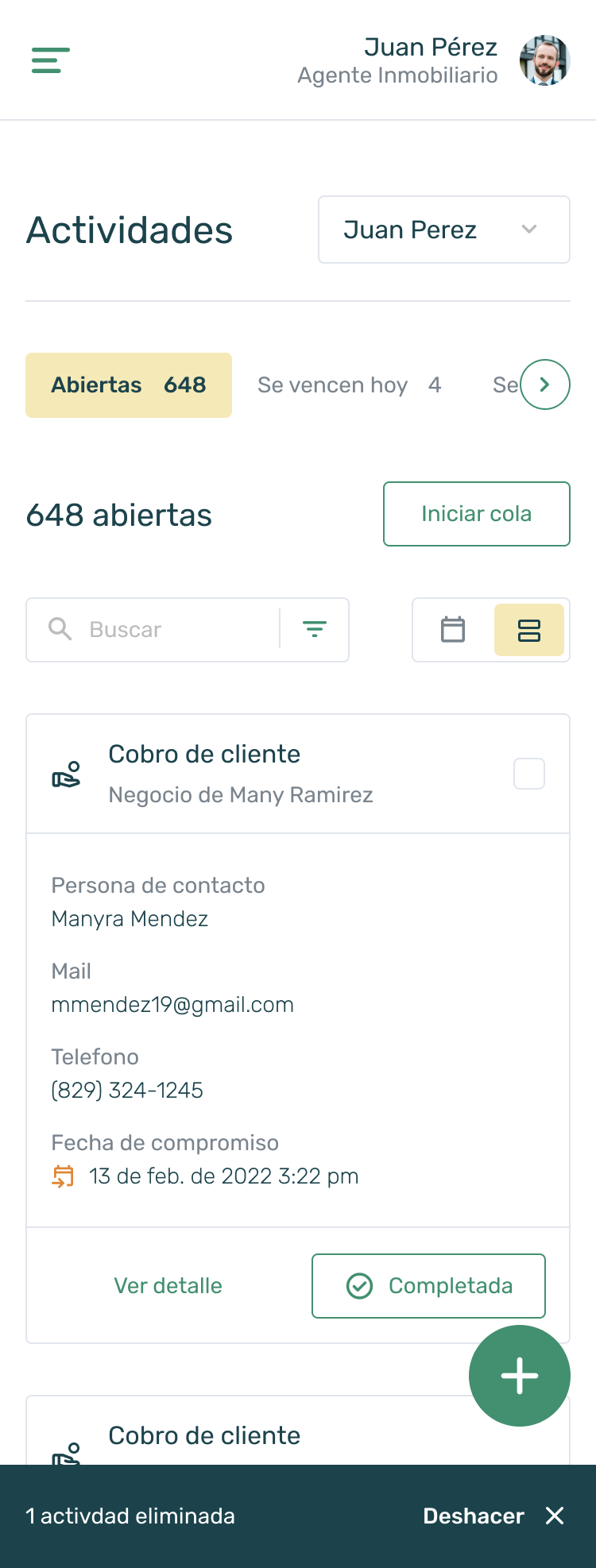
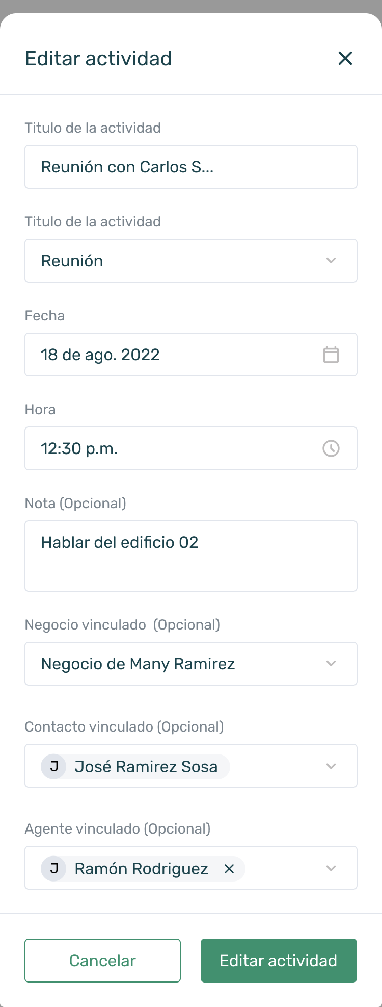
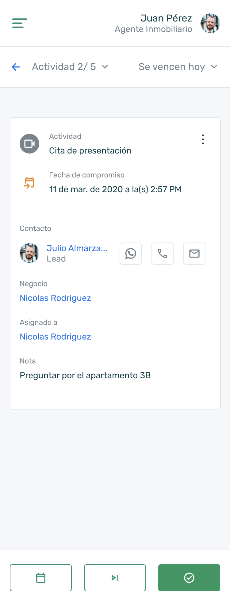
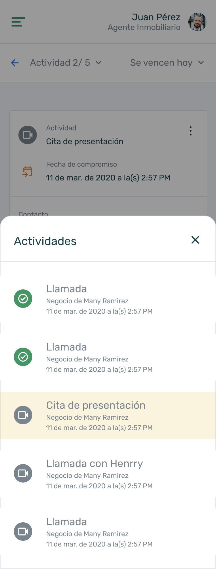
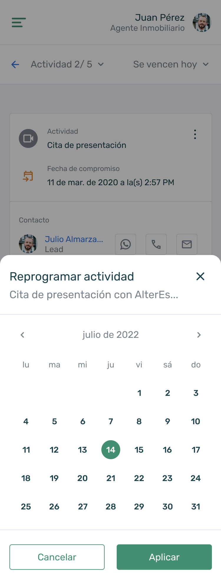
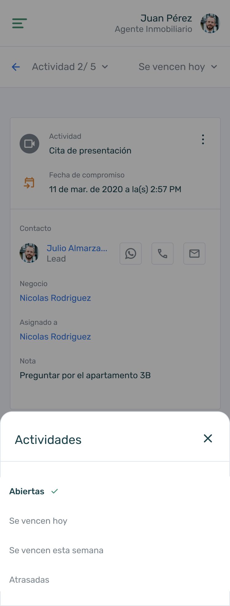
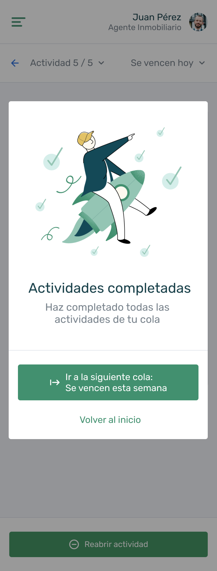
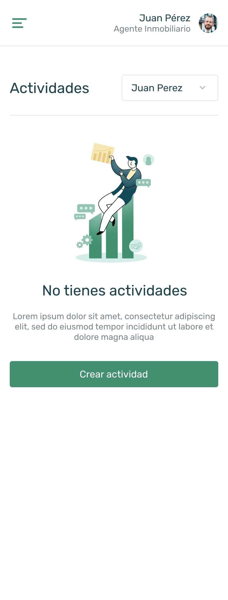
Here is a before and after of the redesign of the activities section, a sample of some screens and some resolutions. Important changes were made that affected the entire application, such as colors and typography, but the general idea is to make a transition between the new design of the sections and the old one, that does not make a great visual impact and that both can coexist while we are playing the other sections.
